There may have been 101 dalmatians, but did you also know there are 101 tactics you can try to increase conversions in your Shopify store? Jevin Maltais, editor of Ecommerce Growth Weekly and ownerof QuickJack Solutions, wrote a cracking article that lists those 101 tactics, which you can read here. The following is an excerpt of Jevin's article that highlights some of those tactics.
There are a myriad of ways to remedy an issue on your Shopify site, especially if sales aren't meeting expectations. But which best help increase conversions?
I've compiled a list of symptoms and different ideas of things you can try to increase conversions. I created this list to make it easier for you to look up your symptom, and find a possible solution to resolve it.
NOTE: Before you attempt any of the changes below, I recommend making them in a data-driven and tested way. Platforms such as Optimizely or Visual Website Optimizer (VWO) help you easily test changes in a systematic, and low risk way. Everyone's store and audience is unique. Ultimately, the best tactic for increasing conversions is to test, test, test, and then test some more.
Symptom: Visitors bounce off landing page
Create a great Unique Value Proposition
Why should someone buy from you? Visitors need to understand this quickly. It's not terribly convincing just to say, "We are the best place to buy XYZ." Look at Zappos.com. Its "Powered by service" message is always somewhere prominent, which translates into its other big theme, "Fast, free shipping on all orders." So...what's your unique value proposition?
Update your design
Check out this case study from 99designs, in which a store experienced a 33% conversion increase just by updating its site design. And remember: make sure to split test changes against your existing theme so you can get accurate results.
Try adding a chat tab
When potential customers have questions, it's a stretch to make them pick up the phone or email you. A simple chat popup (like Olark) can be a low-friction way to get the conversation flowing with your customers. This case study outlines how Acquia can now attribute $5M worth of sales to live chat. You can install the Olark Shopify App here.
Symptom: Visitors bouncing off a product page
Address objections up front
Visitors will have questions when looking at your product. If you can anticipate these questions and answer them right on your product page, this will give the visitor fewer reasons to say no. Here's a case study where addressing objections up front increased sales by 27%.
Symptom: Error page
Call to action from your error page
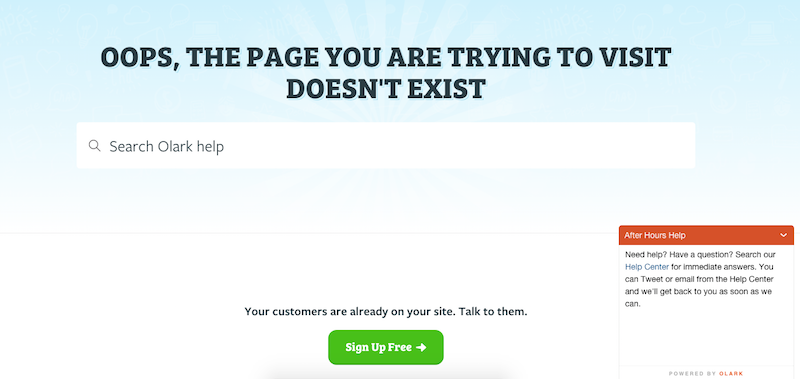
Inevitably, users will hit an error page on your site, and they will likely get frustrated and leave. Instead of telling them to press the back button, consider a button directing them to a particular category page, or an automatic live chat popup that offers to help with whatever the visitor was trying to do.

Symptom: Visitor explores but doesn't add a product to cart
Experiment with different product videos
Got a product video in place? Why not test another video? Use Wistia to host your video. You can actually see how long people watched each video and where they stopped watching. This will give you data to figure out where you can make your product video better. This case study shows how a jewelry site massively increased their revenue with their product videos.

