Today's guest post is from Brandon Liebowitz, founder of SEO Optimizers.
 Most small business owners, when getting started, focus their marketing efforts on increasing traffic to their website. It's understandable - you have to build an audience first.
Smart businesses clearly define their traffic goals and when they've reached them shift focus to increasing their conversion rate.
Conversion rate, for those unfamiliar, is a measure of the number of potential prospects that purchase a product or a service, or complete a desired action, while on your website. Depending on what action you want your customers to take, improving your conversion rate could mean increased sales, improved marketing insight, or any number of outcomes that moves your business forward.
Here at SEO Optimizers, we work with our clients to identify easy website fixes that can improve conversions. So I'd like to take you through three easy fixes that we've seen increase conversions for clients.
Quick fix 1: Transparency
Being transparent with customers can take many forms - product availability, displayed prices, honest reviews from real customers. A customer will trust a site if it's easy to find all of the information needed to make a well informed purchase.
A few areas to consider:
- Product availability - This should be a very easy fix. If a product isn't available, make it obvious. Don't let your customer get all the way to the checkout page before they find out they can't purchase something they really had their heart set on.
- Service limitations - If you can’t deliver something or provide a service to a certain area, make sure your customers know before they click on the checkout button. You could give them an option to enter their pincode in the product page and check whether they can get the item delivered like Pepper Fry does:

- Shipping and taxes - Some retail sites calculate shipping and handling for a customer before they even add an item to their cart. Make the real cost of an item apparent. For example, Flipkart shows the delivery charges as soon as the customer enters their ZIP Code:

Transparency makes it easier for the customer to purchase with confidence, so be upfront with your customers when providing purchasing information.
Quick Fix 2: Have a call to action on every page
To increase conversions, it should be clear what action a visitor should take. To make it clear, use a Call to Action (CTA).
CTAs are an opportunity to motivate your customers closer to make a purchase, sign up or download help colleteral, share something on social media, etc. Typically a CTA is a button, but it could also be clickable text - anything that moves your visitors to the next step in their purchasing process.
Here are some things to remember when designing a CTA:
- Less is more - When it comes to choices, too many choices can confuse your customers. Since your sole purpose is to get them to convert, try to use only one CTA button per page.
- Consider the color - Certain colors have a unique effect on a person’s emotions, so choose whisely when picking your CTA button color. ConversionXL did a fascinating study on CTA button colors. In it they showed that red CTA buttons typically convert best, even though it's a color that indicates is typically associated with 'stop,' 'danger,' or 'hot.' In contrast, green can give reassurance and might be a good choice if you want to give customers confidence in their selection or action.
- Make it easy to read - Large and highly-visible text is ideal for the copy within your CTA. If the font is too small, or if there is too much text inside the CTA button, customers are more likely to move on without clicking. "Click me!" "Sign up now!" "Start download" make it clear that clicking the CTA will initiate something.
Hidden Brains, a mobile application development company, uses CTAs to provide multiple choices, employing attractive colors and using large text:

Quick Fix 3: Only use form fields when you need them
Asking your customer for too much information is also a big mistake and could have a negative effect on your conversion rate.
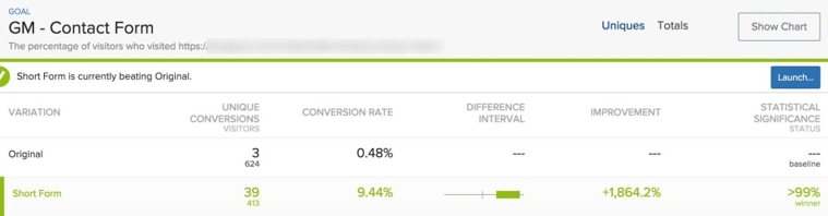
Conversion Fanatics recently tested multiple form fields on a web page. In the original version of the page, customers had to fill in five compulsory fields and two optional fields to contact the sales team. They created a variation with four compulsory fields and one optional field for comments. The conversion rate improved by 1,864% after this change.
Whether customers are filling in a form to request a quote or make a purchase, don't waste your users’ time asking for things you don't need to know. What’s the use of asking for a physical address if they’re only requesting a price quote from you? Or why require a phone number for an eBook download? All of this is doubly true when asking for information your user might consider private, and would obviously hesitate to share without a good reason.
If you're trying to decide how many fields you need on your site, the best thing to do is run A/B tests on two or more variations to see which works best for you.
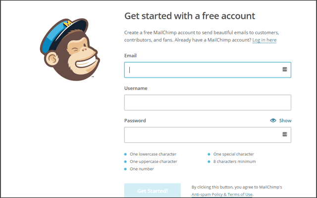
Here's a great example: when users sign up for MailChimp, they're only asked to input an email address along with their desired username and password:
Wrapping Up
Even if you think your conversion rates are high, experimenting with transparency, CTAs, and form fields could help increase your conversions even more. Trying different variants will help you understand what your users respond to best. And remember that increasing conversions is a collaborative effort, so if you have best practices that have worked in the past, please share them in the comments below and help other like-minded business owners.
(Conversion rate image above courtesy of InstantShift.)